Haven’t been posting much on here of late, mainly because I’m busy with big stuff happening (which I will talk about here at a later date), plus working on a much needed major re-design of this site… So apologies for the lack of posting, but I thought I’d break the drought with a little CSS technique for how to make a web page print with a nice header, particularly when using dark or coloured backgrounds in your design.
When I’ve designed a site that’s on a dark background or on a strong coloured background, the print version can look a little odd. In any case print versions can look a little odd until you develop your print stylesheet. Often clients (and developers no doubt) treat the print version as an afterthought. A project I’m currently working has a large recipe component and needs to look good printed, and of course clients being clients, they need to have their branding present, and not replaced by a text version. So I’ve been working on the print stylesheet and the light on dark treatment on screen versus dark on light of the browser’s print function (or when viewing without a stylesheet) present a stark contrast. Take this example (use your browsers print preview):
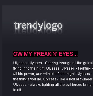
Normal view of header on screen:
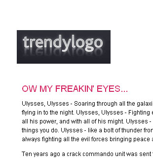
Print preview:
It can often look Not Quite Right, and if the header image in question has a transparent background, it’s particularly unsightly. Browsers by default don’t print background colours and images to save ink. Fair enough. You can change this in the browser preferences, but for obvious reasons you can’t rely on the majority of users to do this. So, generally speaking, we design print stylesheets to work with black (or colour) on white. In the past we’ve created a separate page which is the “printer-friendly version” with different mark-up, use different images, layout, etc. But that’s so 20th century and this is the age of CSS and web 3.0 (well not quite). We can be a bit trickier and use the same code to serve both purposes and use CSS to control the presentation… as you do.
What I’ve decided to do here is have a dark on light version of the header image that appears on the print version as well as any unstyled version (for mobile phone users and people allergic to fancy stylesheets).
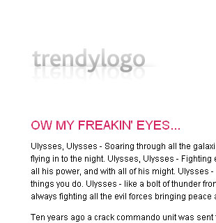
Print friendly header:
![]()
Here’s how we do it:
- We use an img in the heading, in this case I’m using an h2. This image is the printer-friendly version.
- For the screen version we hide the img element (display: none) and use a background image on the h2 (kind of similar to some CSS image replacement techniques).
Pretty simple in the end..?
The code looks like this:
In the HTML:
<div id="masthead">
	<h2><img src="images/logo_print.gif" alt="trendylogo" /></h2>
</div>
In the main CSS:
#masthead h2 {
	margin: 0;
	background: url(images/logo.gif) no-repeat;
	height: 68px;	/* So the h2 doesn't collapse when the img is set to not display */
}
#masthead h2 img {
	display: none;	/* Hide the printer-friendly version on screen */
}
In the printer only CSS:
#masthead h2 img {
	display: inline;	/* Show the heading image */
}
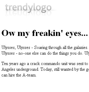
Here’s what the final print version looks like (use your print preview again):
And it also works just fine for the unstyled version:
Thanks to the ever-brilliant Rodos who worked with me to come up with this technique.
3 comments
10:26 am
Very nice. I am especially impressed with your Loren Ipsum 2.0 – “Ulysses A-team”. There really should be a “Ulysses A-Team” plugin for photoshop.
By the way, where can I buy some trendylogo? That stuffs so shinny it’s gotta be good!
10:00 pm
You’re lucky you credited Rodos! He was just looking over my shoulder at your RSS feed and he went, “Hey! That was me!”
11:47 pm
Heh, he knew full well this was going here
Anything cool that happens at Glass Onion, you can pretty much bet Rodos had a lot to do with it.